Typography Task 2 / Typographic Exploration and Communication
13/5/2023 - Ending Date / Week 5 - Ending Week
Dominic Lim Yan Hong / 0354235
Bachelor of Creative Media Design
Task 2: Typographic Exploration and Communication
LECTURES:
Week 5 Lecture Noted in First Task Post
Week 6:
Fig 1.0 Example of different Mediums of Typography
Fig 1.1 Another example of different mediums of typography
Typography was viewed as living only when it reached paper back in the past.Once a publication was edited, it was considered complete and finished, without changes. Good typography and readability were the result of skilled typesetters and designers.
Today typography exists not only on paper but on multitudes of screens. It subjects them to many factors such as system font, the device, the screens, etc. Our experience on typography today changes based on how the page is rendered, because typesetting happens in the browser.
Fig 1.2 Pixel differential between Devices
INSTRUCTIONS:
<iframe src="https://drive.google.com/file/d/1qyFKHVZ1JXoMXMVoDT9CphVfIkMYUflw/preview" width="640" height="480" allow="autoplay"></iframe>
Task 2: Typographic exploration and communication
For this certain task, our lecturer instructed us to format a set of paragraphs to be a readable and digestible format while also creating a type expression, much like the previous task, to fit within the bearings of the grids and arranging it as such.
PROCESS:
I decided to pick the passage 'Unite to Visualise a Better World' as I felt that I can work with a type expression within the realms of that headline. And I found it to be a very intriguing read in that aspect and I initially decided to focus my efforts into creating a type expression on the word 'Unite'.

Fig 2.0 Sketch of initial Idea
I then created this arrangement and format, coupled with the way the body text was structured. I deduced a product such as this.
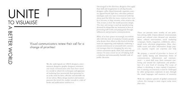
Fig 2.1 Initial Digitization of Type Expression and body text formation

Fig 2.2 Sketch of second type expression
I then sketched out something new, this time, shifting my focus away from the word Unite, and instead, on the word Visualise. This was much easier as I had a relatively simple idea that can get the meaning across without using too much graphical detail.

Fig 2.3 Initial digitization of new Type Expression and text formatting

Fig 2.4 Final Digitization

Fig 2.4 Final Digitization with grids
Fig 2.5 Final PDF with grids
FEEDBACK:
Week 6 General Feedback: Avoid contrasting backgrounds such as black background on top and white at the bottom. Cross alignment needs to be worked on, margin space is not the same, hyphenation needs to be deleted or worked on, type expression should be worked on more
Week 7 General Feedback: Bodoni is not a great font for body text.
REFLECTION:
Experience:
I believe that the lectures and feedback provided by the lecturer helped a lot
in regards to this assignment. It helped me open my eyes to things I either did
not notice or some areas that needed some improvements on.
Observation:
I observed that my creative nature in creating graphics should not be stifled
so much just because it’s a type expression, and rather I should figure out
ways to work around it. My body text needed some work and I had to understand
the more intricate details and whatnot to develop a proper type format.
Findings:
I realized that my initial ideas were not going to cut it as they were quickly
shut down by both the lecturer and my peers as it had nothing to do with the
specific meaning of a certain word. I had to start over, and look at it from a
different point of view, to understand that simple designs can be good in some
regards as long as it is effective. As well as trying to understand more
details in formatting body text such as areas like matching my cross alignments
and creating less ragging within my body text without using a different
alignment in a haphazard manner. Overall I feel like I have learnt quite a bit
in this assignment, and the understanding of building a piece of text and
making them look readable is very well appreciated.
FURTHER READING:
For my further reading, I used this book to further my knowledge about type design.

Fig 3.0 Cover of Typographic Design: Form and Communication
The Evolution of Typography
Excerpt taken from book:
Typography is an evolution of the written word, and as such it
participates in a history of visual communication extending thousands
of years. That evolution is presented here in the form of a timeline that
traces a development from hand, to mechanical, to digital practice, in
the context of world-historical and art-historical events.

Fig 3.1 Timeline of type design in the nineteenth century
The Anatomy of Typography
Excerpt taken from book:
The alphabet is a series of elemental visual signs in a fixed sequence, representing spoken sounds. Each letter signifies only one thing: its elementary sound or name. The twenty- six characters of our alphabet can be combined into hundreds of thousands of words, creating a visual record of the spoken language. This is the magic of writing and typography, which have been called “thoughts made visible” and “frozen sounds.”

Fig 3.2 Historical Classification of typefaces in the form of '&'


.png)
Comments
Post a Comment